Beautiful, Flexible Ecommerce: Many Possibilities with the Modern
Introducing the Modern
We’re happy to introduce a new template system for your store. The Modern template is a modular system allowing you to customize a few sections of the storefront according to your requirements.
With Modern, a number of easily customisable spaces are provided to you that allow you to enhance your storefront’s visual appeal substantially. At the same time, if you do not want to use these spaces, you can toggle them off. The Modern is flexible enough in this way that you can use it in the best way that suites your business and online store strategy.
The increased capability for full-screen graphical presentation means that you will be able to better highlight your products, while also keeping your store up-to-date with the latest design aspects of many modern web sites. The Modern is in keeping with Wowcart’s key concepts, which is to always put easy customisation and management of the store squarely in the hands of the Wowcart customer.
Here’s a breakdown of the main elements of Modern: a top banner, a fullscreen storefront image, a menu, a customisable feature bar and the footer.
Here’s a sample of what you can create using the Modern.

Wowcart – using the Modern template
Create a Store
Get started by creating a store or going to your existing store.
- Stores -> Add New Store or Dashboard -> Add New Store
- Select Design & Logo -> Modern
For existing account owners, your store template is the previous one, which has been named Classic. To use Modern, just click on the Modern template and save the page after customising the Storefront image and Feature Bar.
What’s the difference between Classic and Modern? The main features that have been updated for both Classic and Modern are: the top banner, the menu, breadcrumbs, the product grid, and the footer. Other than breadcrumbs, which is a new feature to enhance navigation, these elements have been given minor appearance enhancements.
3. Logo and Storefront Image
Logo
You can upload your own logo by clicking on Upload, then Browse to select a logo to upload , then Upload. After the logo is uploaded, remember to click on the Save button (at the top right of the page) to save the settings on this page.
If you select No Logo, the banner will load without any logo. This option is great for if you intend to embed your store into a third-party web site, or a blog.
The last option is Store Name as Logo. This means that only your Store Name will appear in the banner.
Menu & Navigational Breadcrumbs
Both the Classic and Modern have improved navigation with a fixed menu and breadcrumbs. Menus and breadcrumbs appear automatically in your storefront.
Storefront Image
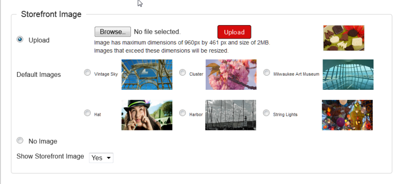
Upload your own storefront image or choose from default options. You can also choose not to show this section of the page entirely
The Storefront Image is a full-screen 960 px by 461 px image occurring after the menu as the main feature of the front page. A text message and link can be configured as a jump-off point. This is a great way to feature high-resolution images of your merchandise, your own banner statement, or a promotional graphic. However, remember that the fixed dimension of 960 by 461 in order for this section of your store to look its best. If an image is below 960 by 461, an error message will display when you try to upload it.
To upload your own image, select Upload, then Browse to select the image to upload from your computer, then Upload, to upload it. To preview the Storefront, make sure you click on Save (top right of pge) first.
If you do not have images on hand, you can select from a number of great options we have provided for you, founder under Default Images.
Finally, select No Image if you do not want the Storefront Image section to show. If this is selected, the Storefront Image section will not appear at al, and the Feature Bar will show immediately below the menu.
The option Show Storefront Image allows you to select an image, but disable showing it for any reason by selecting No. If you need to see the Storefront image again, you can just enable it by selecting Yes.
Important: always remember that you have to save this page in order for your selected storefront image to be displayed. To save, scroll up to the top right of the page and click Save.
4. Feature Box Row

The Feature Bar is a row of 3 jump-off image boxes with descriptive text that can be a Product, Category or type of Promotion, such as a Sale or Promocode. When users click on a box, they will be directed to that Product, Promotion, Sale, Promocode, or Category in your Store. The image and text for this section is taken directly from the Product, Promotion, Sale, Promocode or Category and should be configured from there.
You can select your three Feature Boxes by going to the Type pull-down menu at the right of each Feature Box. Once the Type is selected, all available items of that Type will appear in the Feature Box menu and you can select the item to appear in the Feature Box. The image and text for each Feature Box is configured at the object itself, and you can configure the images and text by accessing the object directly. For example, if you select Category -> Dark Chocolate, the image and description of Dark Chocolate is taken from Products -> Categories -> Dark Chocolate.
For example, configure the Product to be featured by going to Products , locating the Product, and editing it. Configure Promocodes by going to Promotions -> Promocodes and editing the Promocode Landing Page. You can configure Categories by going to Producs -> Categories and editing the Category image, text and description there. You can configure Promocodes and Sales at Promotions .
This is a close-up of the Feature bar.

Store Pages
The Store Pages refer to the following 5 individual content pages – Contact Us, Support, Billing, About Us, Terms & Conditions. Each page will appear as a link in the footer if content is created for the page. If no content is created, the page link will not appear in the footer.
To create your content pages, go to Stores -> Yourstorename -> Store Pages
5. Publish & Miscellaneous
After your storefront page is configured, Publish your store. To do this, make sure you have the minimum Store Settings completed.
Settings: Shipping & Payment
You must set your Store and Product Shipping, and the Payment Options for your Store
First, configure your Payment Methods at Settings -> Payment Method. For more about Payment Methods, please read our knowledge base article on Payment Methods
Then, set the Payment Method for your Store by going to Store Settings -> Payment
Optional Tax settings can also be set at the same place: Store -> Settings
After Shipping and Payment are set, you may Publish your Store. Go to Store -> Yourstorename -> Store Details and click Publish Store
Every time you click on Preview Store, if your Store is already published, you will be able to see it
 Go2Market